Pickup currently unavailable

Size: 23.3x32cm, 17.2x23.5cm
Medium: Cotton
Edition: 10
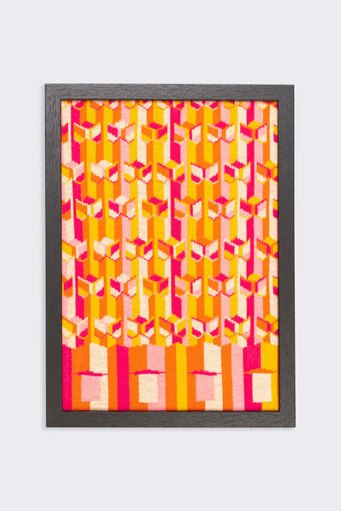
The design of the exterior wall of Melbourne Plaza in Central looks like a series of endless waves. In fact, this landscape is composed of countless three-dimensional triangles. To enhance lighting, the designer installed windows on both sides of the triangle. At noon, the sunlight is reected by the glass, as if a wave is projected on the city center of Central. Like most commercial buildings in the 70s, the lower floors of Melbourne Plaza was designed as a shopping mall, luckily it has not undergone major renovations, and it still retains the charm of half a century ago.
中環萬邦行的外牆設計看似一連串無窮無盡的波浪,實際上這片風景 是由無數立體三角形組成,為加強採光,設計師在三角形兩側設有窗 戶,正午時份陽光被玻璃反射,彷彿海浪投映在中環市中心一樣。如同 大多數七十年代商廈,萬邦行底層被設計成一個商場,幸好沒有經過 大裝修,讓它時至今日仍可保留着半世紀前的韻味。
